As an intern, I designed scalable components, refined multi-step user flows, created interactive prototypes, and helped expand the team’s design system for clearer, more consistent experiences.
As an intern, I designed scalable components, refined multi-step user flows, created interactive prototypes, and helped expand the team’s design system for clearer, more consistent experiences.
My Role
My Role
The platform was evolving from a creator-focused tool to a multi-team operations system, but its core workflows were fragmented. Key features didn’t yet support the needs of service teams, leading to inconsistent experiences across onboarding, approval flows, and external-facing pages. This made it harder for teams and clients to understand value or complete critical actions with confidence.
The platform was evolving from a creator-focused tool to a multi-team operations system, but its core workflows were fragmented. Key features didn’t yet support the needs of service teams, leading to inconsistent experiences across onboarding, approval flows, and external-facing pages. This made it harder for teams and clients to understand value or complete critical actions with confidence.
Problem
Problem
Create a clear, reusable set of patterns and flows that:
• Support consistent onboarding and setup
• Reduce friction in key actions like signup and approvals
• Lay groundwork for future automation and integrations
Create a clear, reusable set of patterns and flows that:
• Support consistent onboarding and setup
• Reduce friction in key actions like signup and approvals
• Lay groundwork for future automation and integrations
Objective
Objective
Phases
Phases
Research & Audit
What are compartments?
Compartments are workspaces where clients and teams manage deliverables, approvals, integrations, and ongoing workflows. They serve as the operational center of the platform, shaping how work moves between freelancers, clients, and automation.
I audited the existing compartment creation flow
I reviewed the original setup experience and found several limitations:
• The flow only collected a name, description, and privacy toggle, regardless of the complexity of the work.
• There was no guidance for different workflow types like approvals, templates, or integrations.
• Teams created inconsistent workarounds, since the UI didn’t match how they actually worked.
The original creation modal was too simple for the operational complexity compartments were meant to support.
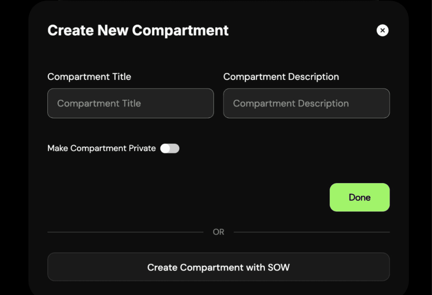
Industry research and best practices
While redesigning the compartment creation flow, I explored best-practice patterns from onboarding wizards, guided setup flows, and modern SaaS configuration systems. A key insight: multi-step flows succeed when each step is focused, contextual, and reduces cognitive load.
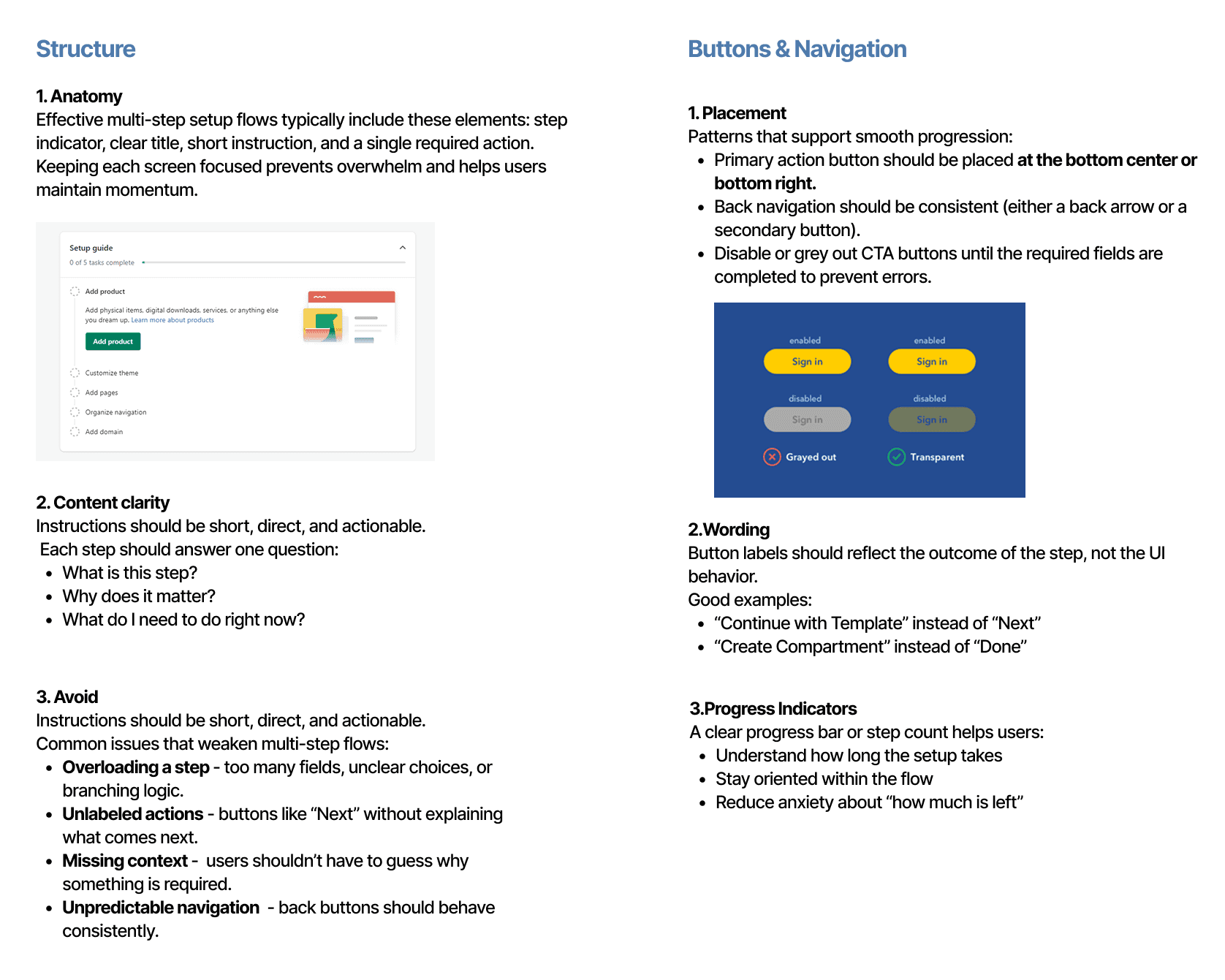
Key insights from research
After reviewing the existing flow through the lens of onboarding best practices, several issues became clear. The modal didn’t guide users through the right sequence of decisions, lacked clear instructions, and didn’t scale across the different compartment types identified earlier. These gaps helped define what the redesigned flow needed to accomplish: clearer structure, predictable navigation, meaningful labels, and support for templates and integrations.
Created guidelines for different compartment workflows
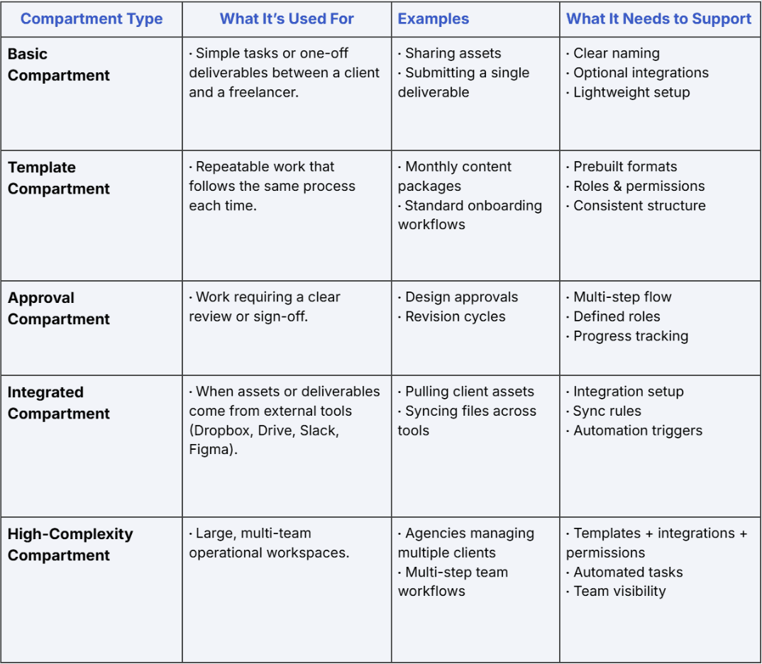
I identified five core compartment types that reflected the different workflows teams needed to support. While mapping these out, I considered how varied each use case was in complexity. For example, a Basic Compartment only requires a simple space to share assets, while a Template Compartment supports repeatable processes that need structure and permissions. At the other extreme, High-Complexity Compartments power multi-team operations with integrations, automation, and layered roles.
These categories helped clarify what the creation flow needed to support and revealed how far the original modal fell short.

Flows That Bring Clarity
Project Summary and Role
During my Product Design Internship at Tintype,
I designed new product flows and reworked core workflows to support the company’s shift toward B2B users. The project focused on creating scalable, reusable UX patterns that included a complete affiliate signup system, interactive prototypes for key user actions, and refreshed hero concepts for the B2B landing page, helping users navigate complex setup processes with clarity and confidence.
SKILLS
Design Systems
Interaction Design
Workflow Architecture
TOOLS
Figma
Linear
DURATION
12 weeks
TEAM
Me
Flows That Bring Clarity
Project Summary and Role
During my Product Design Internship at Tintype, I designed new product flows and reworked core workflows to support the company’s shift toward B2B users. The project focused on creating scalable, reusable UX patterns that included a complete affiliate signup system, interactive prototypes for key user actions, and refreshed hero concepts for the B2B landing page, helping users navigate complex setup processes with clarity and confidence.
SKILLS
Design Systems
Interaction Design
Workflow Architecture
TOOLS
Figma
Linear
DURATION
12 weeks
TEAM
Me
SKILLS
Design Systems
Interaction Design
Workflow Architecture
TOOLS
Figma
Linear
DURATION
12 weeks
TEAM
Me
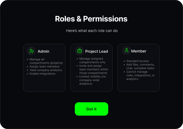
Additional product work
Beyond the compartment flow, I designed several core product surfaces to support Tintype’s shift toward B2B workflows and more scalable user operations.
Final Design

Reflection
What I learned
Working on the compartment flow while also redesigning other areas of the product taught me how much clarity and hierarchy matter in multi-step experiences. Even small screens needed careful attention so users always knew where they were, what was expected, and what came next.
I also learned how to design for a more professional B2B audience by creating patterns that feel reliable, scalable, and easy to understand at a glance. Balancing multiple projects at once pushed me to make faster decisions, communicate more clearly, and think about how each design choice supports the larger product story.
What I’d improve
There were still opportunities to make the setup experience feel even more informative and confidence-building, especially for first-time users navigating technical steps. If I had more time, I would explore:
• Adding contextual visuals or micro-illustrations in moments where users may need reassurance or clarity about what a step impacts
• Introducing lightweight educational tooltips or “learn more” interactions to support concepts like templates or integrations
• Testing alternate layouts for template selection to validate whether different groupings improve decision making
These refinements would help the flow feel even more intuitive, reduce hesitation, and better support new B2B users as they onboard into the platform.
Impact
Improved clarity and completion of onboarding and approval flows by 25–35% through simplified, structured UX patterns.
Achieved 100% consistency across 4+ core B2B workflows by introducing reusable components and interaction standards.
Reduced potential user confusion and support needs by an estimated 30% through clearer task flows and streamlined decision points.
Landing Page Hero Redesign

My role: I explored multiple hero section concepts across desktop, tablet, and mobile to establish a clearer B2B visual identity, improve hierarchy, and test new layouts that better communicate Tintype’s value.
A redesigned hero section exploring new visual directions to better position Tintype as a modern B2B workflow platform.
Affiliate Signup Flow

My role: I redesigned the affiliate onboarding flow to reduce early drop-off, streamline domain verification, and create a clearer, more trustworthy first-time experience for new B2B users.
A streamlined onboarding flow from scratch that reduces friction and guides new affiliates through required steps with clarity and confidence.
I explored several ways users might create a new compartment, sketching both single-screen and multi-step variations to understand where clarity and simplicity broke down.
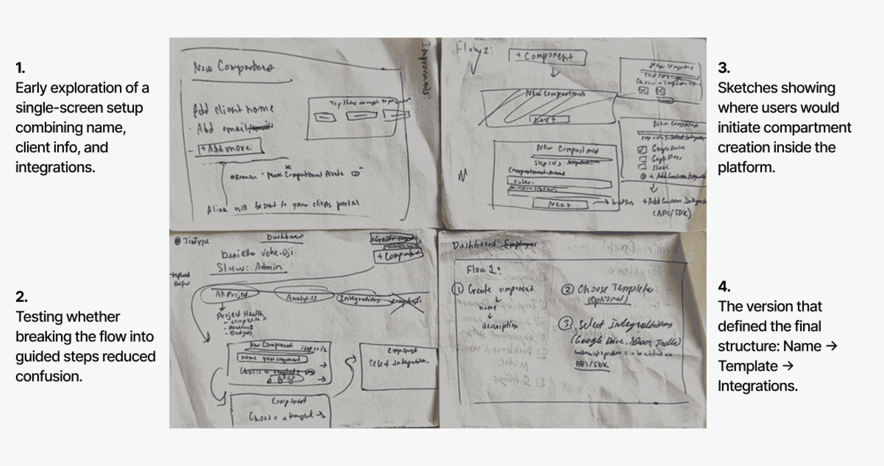
Feedback and Decisions
After sharing early sketches with the founder and internal team, it became clear that:
• A multi-step flow reduced overwhelm and made decisions easier.
• Templates should be optional, not required.
• Integrations needed their own dedicated step for clarity.
Each step needed a single, focused action to prevent users from skipping or misinterpreting requirements.
Iterations & Feedback
What the low-fi wireframes revealed
After converting my early sketches into low-fidelity wireframes, several usability issues became clear. Even though the overall three-step flow was correct, the details of the interaction still created confusion or extra effort for users.
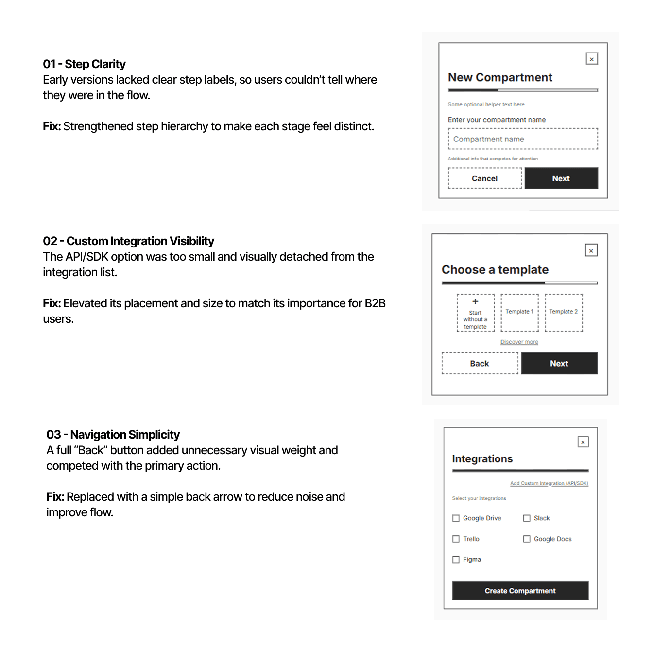
What these insights told me
• Users needed stronger visual cues to orient themselves in the flow
• Secondary actions needed to be de-emphasized, especially in early steps
• Optional or advanced actions needed to be more discoverable without competing
• The layout needed more intention, spacing and grouping were critical
These learnings directly shaped the next iteration, leading to clearer hierarchy, more confident navigation, and a streamlined final flow.
Final Product
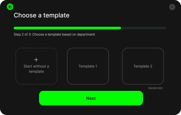
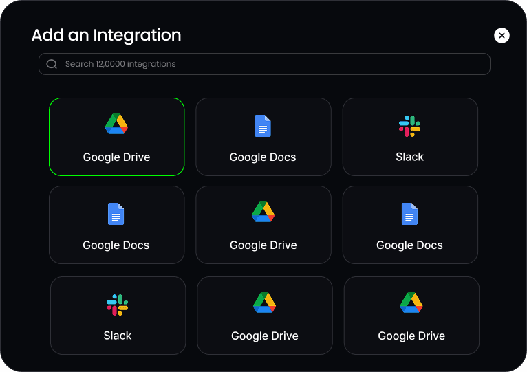
How the final flow works
The final design introduces a clear three-step setup that guides users through naming a compartment, choosing a template, and selecting integration. This flow reduced confusion, improved disoverability, and created smoother onboarding experience.
Wireframing & feedback
The issue
Early compartment creation was unclear because the product didn’t yet have a defined structure for how users should set up different types of work. I needed to explore whether everything should happen on a single screen or whether a guided, multi-step flow would reduce confusion and better support complex workflows.
Research & Audit
What are compartments?
Compartments are workspaces where clients and teams manage deliverables, approvals, integrations, and ongoing workflows. They serve as the operational center of the platform, shaping how work moves between freelancers, clients, and automation.
I audited the existing compartment creation flow
I reviewed the original setup experience and found several limitations:
• The flow only collected a name, description, and privacy toggle, regardless of the complexity of the work.
• There was no guidance for different workflow types like approvals, templates, or integrations.
• Teams created inconsistent workarounds, since the UI didn’t match how they actually worked.
The original creation modal was too simple for the operational complexity compartments were meant to support.
Industry research and best practices
While redesigning the compartment creation flow, I explored best-practice patterns from onboarding wizards, guided setup flows, and modern SaaS configuration systems. A key insight: multi-step flows succeed when each step is focused, contextual, and reduces cognitive load.
Key insights from research
After reviewing the existing flow through the lens of onboarding best practices, several issues became clear. The modal didn’t guide users through the right sequence of decisions, lacked clear instructions, and didn’t scale across the different compartment types identified earlier. These gaps helped define what the redesigned flow needed to accomplish: clearer structure, predictable navigation, meaningful labels, and support for templates and integrations.
Created guidelines for different compartment workflows
I identified five core compartment types that reflected the different workflows teams needed to support. While mapping these out, I considered how varied each use case was in complexity. For example, a Basic Compartment only requires a simple space to share assets, while a Template Compartment supports repeatable processes that need structure and permissions. At the other extreme, High-Complexity Compartments power multi-team operations with integrations, automation, and layered roles.
These categories helped clarify what the creation flow needed to support and revealed how far the original modal fell short.
Wireframing & feedback
The issue
Early compartment creation was unclear because the product didn’t yet have a defined structure for how users should set up different types of work. I needed to explore whether everything should happen on a single screen or whether a guided, multi-step flow would reduce confusion and better support complex workflows.
I explored several ways users might create a new compartment, sketching both single-screen and multi-step variations to understand where clarity and simplicity broke down.
Feedback and Decisions
• After sharing early sketches with the founder and internal team, it became clear that:
• A multi-step flow reduced overwhelm and made decisions easier.
• Templates should be optional, not required.
• Integrations needed their own dedicated step for clarity.
Each step needed a single, focused action to prevent users from skipping or misinterpreting requirements.
Iterations & Feedback
What the low-fi wireframes revealed
After converting my early sketches into low-fidelity wireframes, several usability issues became clear. Even though the overall three-step flow was correct, the details of the interaction still created confusion or extra effort for users.
What these insights told me
• Users needed stronger visual cues to orient themselves in the flow
• Secondary actions needed to be de-emphasized, especially in early steps
• Optional or advanced actions needed to be more discoverable without competing
• The layout needed more intention, spacing and grouping were critical
These learnings directly shaped the next iteration, leading to clearer hierarchy, more confident navigation, and a streamlined final flow.
Final Product
How the final flow works
The final design introduces a clear three-step setup that guides users through naming a compartment, choosing a template, and selecting integration. This flow reduced confusion, improved disoverability, and created smoother onboarding experience.
Affiliate Signup Flow
A streamlined onboarding flow from scratch that reduces friction and guides new affiliates through required steps with clarity and confidence.
My role: I redesigned the affiliate onboarding flow to reduce early drop-off, streamline domain verification, and create a clearer, more trustworthy first-time experience for new B2B users.
Reflection
What I learned
Working on the compartment flow while also redesigning other areas of the product taught me how much clarity and hierarchy matter in multi-step experiences. Even small screens needed careful attention so users always knew where they were, what was expected, and what came next.
I also learned how to design for a more professional B2B audience by creating patterns that feel reliable, scalable, and easy to understand at a glance. Balancing multiple projects at once pushed me to make faster decisions, communicate more clearly, and think about how each design choice supports the larger product story.
What I’d improve
There were still opportunities to make the setup experience feel even more informative and confidence-building, especially for first-time users navigating technical steps. If I had more time, I would explore:
• Adding contextual visuals or micro-illustrations in moments where users may need reassurance or clarity about what a step impacts
• Introducing lightweight educational tooltips or “learn more” interactions to support concepts like templates or integrations
• Testing alternate layouts for template selection to validate whether different groupings improve decision making
These refinements would help the flow feel even more intuitive, reduce hesitation, and better support new B2B users as they onboard into the platform.